css3中新增加的颜色模式有哪些
时间:2022-02-11 16:38
css新增了3种颜色模式:1、RGBA模式,是在RGB模式上新增了Alpha透明度,例“rgba(255,0,0,0.5)”;2、HSL模式,例“hsl(360,50%,50%)”;3、HSLA模式,是在HSL模式上新增了Alpha透明度。 本教程操作环境:windows7系统、CSS3版、Dell G3电脑。 一、CSS1&2颜色表示方式(W3C标准) 1、Color name 颜色名称方式(用颜色关键字表示对应的颜色。) 例如:red(红色)、blue(蓝色)、pink(粉色) 优点:方便快捷而且特定颜色比较准确 缺点: 表示颜色数量有限。 不支持透明颜色. 2、HEX方式 十六进制方式(使用十六进制表示颜色) 语法: 取值: RR: 红色值。十六进制正整数 GG: 绿色值。十六进制正整数 BB: 蓝色值。十六进制正整数 取值范围:00-FF 例如: 优点:表示颜色种类多,使用较方便 缺点: 16进制单位换算很成问题 不支持透明颜色。 特定颜色需要工具配合或者一定的颜色调配知识 3、RGB方式 三原色配色方式 语法: 取值: R: 红色值。正整数 | 百分数 G: 绿色值。正整数 | 百分数 B: 蓝色值。正整数 | 百分数 取值范围:0~255或者0%~100% 例如: 优点:表示颜色种类多,使用较方便 缺点: 不支持透明颜色 特定颜色需要工具配合或者一定的颜色调配知识 二、CSS3 新增颜色表示方式 1、RGBA模式 此色彩模式与RGB相同,只是在RGB模式上新增了Alpha透明度。 语法: 取值: R: 红色值。正整数 | 百分数 G: 绿色值。正整数 | 百分数 B: 蓝色值。正整数 | 百分数 A: Alpha透明度。取值0~1之间。 例如: 2、HSL模式(色轮模式没有透明度) 语法: 取值: H: Hue(色调)。–0(或360)表示红色,120表示绿色,240表示蓝色,也可取其他数值来指定颜色。取值为:0 - 360 S: Saturation(饱和度)。取值为:0.0% - 100.0% L: Lightness(亮度)。取值为:0.0% - 100.0% 例如: 3、HSLA模式(色轮模式有透明度) 语法: 取值: H: Hue(色调)。–0(或360)表示红色,120表示绿色,240表示蓝色,也可取其他数值来指定颜色。取值为:0 - 360 S: Saturation(饱和度)。取值为:0.0% - 100.0% L: Lightness(亮度)。取值为:0.0% - 100.0% A: Alpha透明度。取值0~1之间。 例如: (学习视频分享:css视频教程) 三、其他属性 1、transparent 特殊颜色值,表示透明色。可以直接当做颜色使用。 例如:color:transparent 设定字体颜色为透明 2、Opacity属性 作用:设定元素的透明度。 取值:0~1之间 注意:对于尚不支持opacity属性的IE浏览器 滤镜:filter:alpha(opacity=50) 仅限IE 四、CSS3 颜色使用实例 1、模拟渐变效果 使用透明度来模拟渐变 使用饱和度模拟渐变 使用亮度来实现模拟渐变 使用背景颜色: 更多编程相关知识,请访问:编程视频!! 以上就是css3中新增加的颜色模式有哪些的详细内容,更多请关注gxlsystem.com其它相关文章!
#RRGGBB 或 #RGB
#FF0000红色 #FFFF00 黄色。RGB(R,G,B)
rgb(255,0,0)红色 rgb(255,255,0)黄色RGBA(R,G,B,A)
rgba(255,0,0,0.5)半透明红色<style type="text/css">
body{background:rgba(255,0,0,1)}
div{width:300px;
height:300px;
background:rgba(0,0,255,0.4);
position:absolute;
top:0;
left:0;
}
</style>
<body>
猜猜我在哪里
<div></div>
</body>HSL(H,S,L)
hsl(360,50%,50%) 红色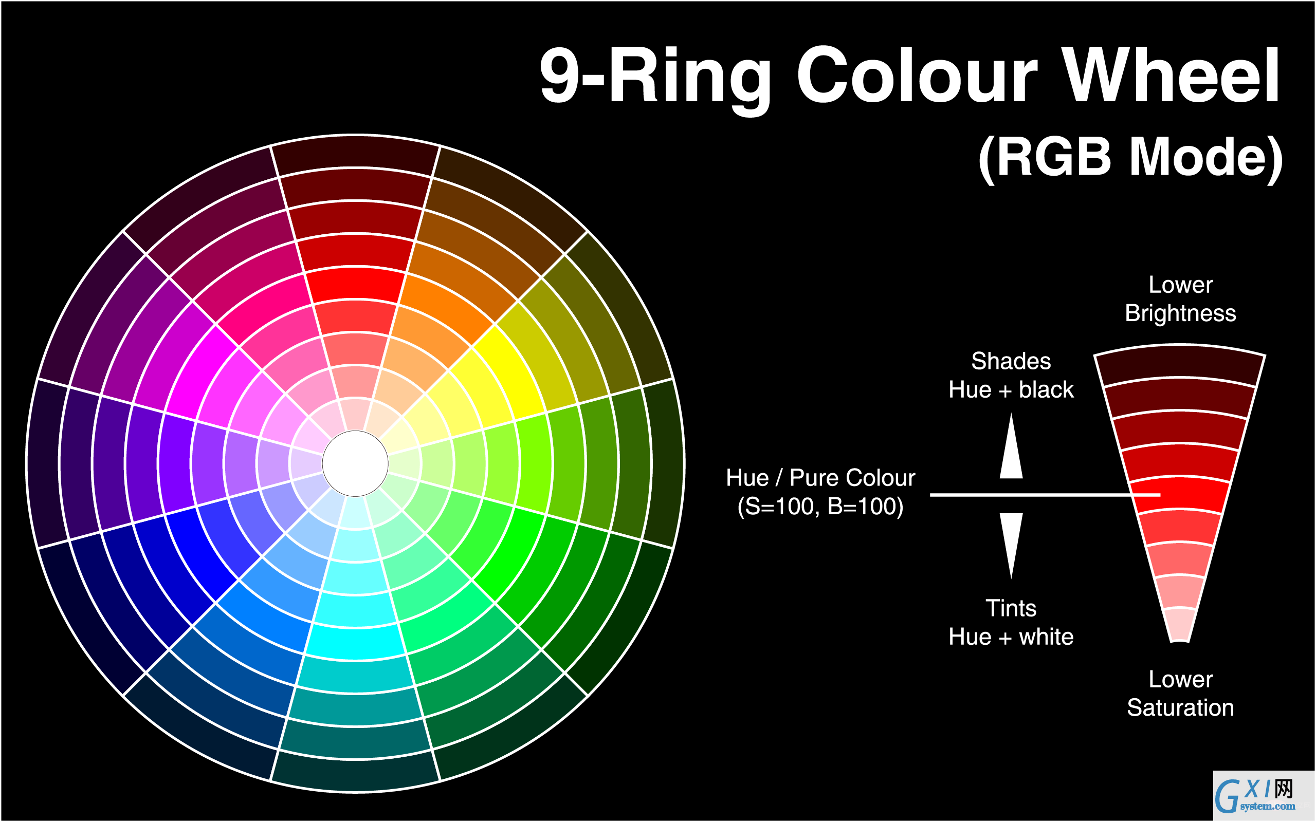
<style type="text/css">
    body{background:rgba(0,0,255,0.5);}
    div{width:300px;
        height:300px;
        background:hsl(140,50%,50%);
        position:absolute;
        top:0;
        left:0;
    }
</style>
<body>
    <div></div>
</body>HSLA(H,S,L,A)
hsl(360,50%,50%,0.5) 红色<style>
body{background:HSL(0,100%,50%)}
div{width:300px;
height:300px;
background:HSLA(230,100%,50%,0);
position:absolute;
top:0;
left:0;
}
</style>
</head>
<body>
猜猜我在哪里
<div></div>
</body><style type="text/css">
body{background:hsl(270,100%,50%)}
p{
font-size:50px;
font-family:"黑体";
/*浏览器私有属性*/
-webkit-text-fill-color:transparent;/*设置文本透明*/
/*使用rgba(0,0,0,0);也可以实现全透明模式*/
-webkit-text-stroke:2px yellow;/*将文本设置透明,再设置个边框后就实现镂空字了*/
/*W3C标准属性*/
/*text-fill-color:transparent;*/
/*text-stroke:2px yellow;*/
}
</style>
<body>
<p>2012年过去了,最忙的是元芳,你怎么看?</p>
</body><style>
body{background:red}
div{background:blue;
width:300px;
height:300px;
opacity:0.5;
position:absolute;
top:0;
left:0
}
</style>
</head>
<body>
看到我你就成功了
<div></div>
</body>background-image: -ms-linear-gradient(top, #D35644 0%, #31264D 100%) !important;/* Mozilla Firefox */
background-image: -moz-linear-gradient(top, #D35644 0%, #31264D 100%) !important;/* Opera */
background-image: -o-linear-gradient(top, #D35644 0%, #31264D 100%) !important;/* Webkit (Safari/Chrome 10) */
background-image: -webkit-gradient(linear, left bottom, left top, color-stop(0, #D35644), color-stop(1, #31264D)) !important;/* Webkit (Chrome 11+) */
background-image: -webkit-linear-gradient(top, #D35644 0%, #31264D 100%) !important;/* W3C Markup, IE10 Release Preview */
background-image: linear-gradient(to bottom, #D35644 0%, #31264D 100%) !important; }
<style>
    div{height:30px}
    div:nth-child(1){background:HSLA(120,100%,50%,0.1)}
    div:nth-child(2){background:HSLA(120,100%,50%,0.2)}
    div:nth-child(3){background:HSLA(120,100%,50%,0.3)}
    div:nth-child(4){background:HSLA(120,100%,50%,0.4)}
    div:nth-child(5){background:HSLA(120,100%,50%,0.5)}
    div:nth-child(6){background:HSLA(120,100%,50%,0.6)}
    div:nth-child(7){background:HSLA(120,100%,50%,0.7)}
    div:nth-child(8){background:HSLA(120,100%,50%,0.8)}
    div:nth-child(9){background:HSLA(120,100%,50%,0.9)}
    div:nth-child(10){background:HSLA(120,100%,50%,1.0)}
</style>
</head>
<body>
    <div></div>
    <div></div>
    <div></div>
    <div></div>
    <div></div>
    <div></div>
    <div></div>
    <div></div>
    <div></div>
    <div></div>
</body><style>
div{height:30px}
div:nth-child(1){background:HSLA(120,100%,50%,1)}
div:nth-child(2){background:HSLA(120,90%,50%,1)}
div:nth-child(3){background:HSLA(120,80%,50%,1)}
div:nth-child(4){background:HSLA(120,70%,50%,1)}
div:nth-child(5){background:HSLA(120,60%,50%,1)}
div:nth-child(6){background:HSLA(120,50%,50%,1)}
div:nth-child(7){background:HSLA(120,40%,50%,1)}
div:nth-child(8){background:HSLA(120,30%,50%,1)}
div:nth-child(9){background:HSLA(120,20%,50%,1)}
div:nth-child(10){background:HSLA(120,10%,50%,1)}
</style>
</head>
<body>
<div></div>
<div></div>
<div></div>
<div></div>
<div></div>
<div></div>
<div></div>
<div></div>
<div></div>
<div></div>
</body>
</html><style>
div{height:30px}
div:nth-child(1){background:HSLA(120,100%,100%,1)}
div:nth-child(2){background:HSLA(120,100%,90%,1)}
div:nth-child(3){background:HSLA(120,100%,80%,1)}
div:nth-child(4){background:HSLA(120,100%,70%,1)}
div:nth-child(5){background:HSLA(120,100%,60%,1)}
div:nth-child(6){background:HSLA(120,100%,50%,1)}
div:nth-child(7){background:HSLA(120,100%,40%,1)}
div:nth-child(8){background:HSLA(120,100%,30%,1)}
div:nth-child(9){background:HSLA(120,100%,20%,1)}
div:nth-child(10){background:HSLA(120,100%,10%,1)}
</style>
</head>
<body>
<div></div>
<div></div>
<div></div>
<div></div>
<div></div>
<div></div>
<div></div>
<div></div>
<div></div>
<div></div>
</body><style>
#div1 { width:200px; height:200px; border:1px solid #333;
background:-moz-linear-gradient(top, red, yellow);
background:-webkit-linear-gradient(top, red, yellow);
background:-ms-linear-gradient(top, red, yellow);
background:linear-gradient(top, red, yellow);
-ms-filter:"progid:DXImageTransform.Microsoft.gradient (GradientType=0, startColorstr=red, endColorstr=yellow)";
+background:#f9f9f9;/*兼容IE9,8,7*/
}
</style>
</head>
<body>
<div id="div1"></div>
</body>