css3怎么实现3d翻转效果
时间:2022-02-11 16:41
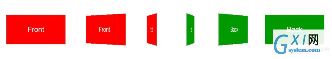
在css3中,可以使用transform属性配合rotateY()、rotateX()等3d旋转函数来实现3d翻转效果。rotateX()可以使元素绕其X轴旋转给定角度,rotateY()可以使元素绕其Y轴旋转给定角度。 本教程操作环境:windows7系统、CSS3&&HTML5版、Dell G3电脑。 1、HTML结构 上述HTML的结构是: 思路是:将figure.front和figure.back作为翻转图片的正反面。图片翻转后,figure.back将变成面对用户的那一面,figure.front将背对用户。 初始状态下figure.back是水平翻转过的(即transform: rotateY(180deg)),这样图片翻转后背面的文字将正着显示(否则翻转过来以后背面的文字是倒着的——因为反转之前是正着的嘛~)。 3、CSS结构 现在分析每个元素的CSS: 没什么好说的,去掉内外边距! 为3D舞台定义样式。margin是为了距离浏览器左边和上边有一些距离,让变换显示的更完整。perspective规定了3D元素距摄像机(或人眼)的距离,值越小3D元素离人眼越近,值越大3D元素离人眼越远。 为翻转盒子定义样式。这个元素是真正进行3D变换的元素。其position属性是为其两个子figure元素创造定位点,以便两个子figure元素定位到p.flipBox的左上角实现两张图片的对齐。transform-style属性是必须的,这规定了p.flipBox元素的后代元素是以哪种形式进行3D变换(preserve-3d表示后代元素任然以3d的模式进行变换;另一个值flat表示只对p.flipBox进行3D变换,后代元素则只是p.flipBox平面中的内容,不进行3D变换),这和After Effect中的伪3D十分相似。transition规定只变换transform属性,时间为1s. 为两张图片(这里的两个figure)规定统一的样式。使用绝对定位,定位到p.flipBox的左上角,而两个figure的大小又是一样的,所以完美重叠。backface-visibility是一个重要的属性,它规定背对用户的3D元素是否显示,这里应该规定为不显示(hidden),否则不该显示背面的时候背面会显示出来。比如初始状态,显然不应该显示figure.back,但又因为figure.back是后渲染的,所以会覆盖在figure.front上,我们之前为figure.back规定了transform: rotateY(180deg),所以figure.front是背对用户的,将不显示。再比如翻转过后,figure.front会挡在figure.back前面,不过此时figure.front将会背对用户,所以被backface-visibility隐藏了,这正是我们想要的。 规定了图片正面为红色。 规定了图片背面为绿色,同时,transform: rotateY(180deg)规定在初始状态,figure.back是水平翻转180°的。 3、开始旋转图片 当鼠标移入3D舞台时,将p.flipBox旋转-180°,实现图片翻转效果。这里让p.flipBox旋转+180°也是可以的,只是旋转的方向不同罢了。 1、图片准备 为减少HTTP请求,这里使用精灵图。 2、代码实现 (学习视频分享:css视频教程) 以上就是css3怎么实现3d翻转效果的详细内容,更多请关注gxlsystem.com其它相关文章!
一、实现一张图片的翻转
<div class="stage">
    <div class="flipBox">
        <figure class="pic front">Front</figure>
        <figure class="pic back">Back</figure>
    </div>
</div>body,figure {
margin: 0;
padding: 0;
}
.stage {
    width: 200px;
    height: 100px;
    margin: 40px;
    perspective: 1000px;
}
.flipBox {
    width: 200px;
    height: 100px;
    position: relative;
    transform-style: preserve-3d;
    transition: transform 1s;
}
.pic {
    width: 200px;
    height: 100px;
    font-size: 24px;
    color: #fff;
    line-height: 100px;
    text-align: center;
    position: absolute;
    top: 0;
    left: 0;
    backface-visibility: hidden;
}
.front {
    background: #f00;
}
.back {
    background: #090;
    transform: rotateY(180deg);
}body,figure {
margin: 0;
padding: 0;
}.stage {
width: 200px;
height: 100px;
margin: 40px;
perspective: 1000px;
}.flipBox {
width: 200px;
height: 100px;
position: relative;
transform-style: preserve-3d;
transition: transform 1s;
}.pic {
width: 200px;
height: 100px;
font-size: 24px;
color: #fff;
line-height: 100px;
text-align: center;
position: absolute;
top: 0;
left: 0;
backface-visibility: hidden;
}.front {
background: #f00;
}.back {
background: #090;
transform: rotateY(180deg);
}.stage:hover .flipBox {
transform: rotateY(-180deg);
}
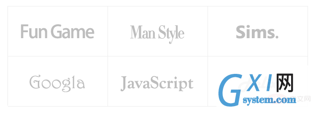
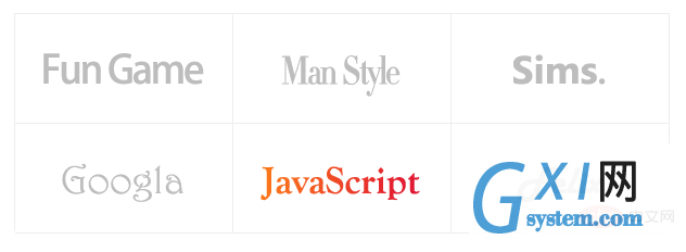
二、案例
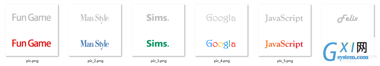
图片大小为200*200,分上下两部分,上方为翻转图片的正面(黑白),下方为翻转图片的背面(彩色)。上方和下方的logo都经过水平居中和垂直居中,以保证翻转前后logo位置一致。<!doctype html>
<html>
<head>
<meta charset="UTF-8">
<title>JavaScript Study</title>
<style>
html,body,ul,li,a,figure,h4 {
padding: 0;
margin: 0;
}
ul {
list-style: none;
}
h4 {
display: none;
}
.Stage {
width: 604px;
height: 203px;
margin: 50px;
border-left: 1px solid #f5f5f5;
border-top: 1px solid #f5f5f5;
perspective: 10000px;
}
.trigger {
display: block;
float: left;
width: 200px;
height:100px;
border-right: 1px solid #f5f5f5;
border-bottom: 1px solid #f5f5f5;
position: relative;
}
.flipBox {
display: block;
width: 100%;
height: 100%;
transform-style: preserve-3d;
transition: transform 1.2s;
transition-delay: 0.03s;
}
.trigger:hover .flipBox {
transform: perspective(10000px) rotateY(-180deg); /*这里的perspective为每个flipBox规定单独的视点距离,解决Chrome中统一视点的问题*/
}
.plane {
width: 200px;
height: 100px;
position: absolute;
top: 0;
left: 0;
backface-visibility: hidden;
}
.back {
transform: rotateY(180deg);
}
.logo1 figure.front {
background: url("pic.png") center 0 no-repeat;
}
.logo2 figure.front {
background: url("pic_2.png") center 0 no-repeat;
}
.logo3 figure.front {
background: url("pic_3.png") center 0 no-repeat;
}
.logo4 figure.front {
background: url("pic_4.png") center 0 no-repeat;
}
.logo5 figure.front {
background: url("pic_5.png") center 0 no-repeat;
}
.logo6 figure.front {
background: url("pic_6.png") center 0 no-repeat;
}
.logo1 figure.back {
background: url("pic.png") center -100px no-repeat;
}
.logo2 figure.back {
background: url("pic_2.png") center -100px no-repeat;
}
.logo3 figure.back {
background: url("pic_3.png") center -100px no-repeat;
}
.logo4 figure.back {
background: url("pic_4.png") center -100px no-repeat;
}
.logo5 figure.back {
background: url("pic_5.png") center -100px no-repeat;
}
.logo6 figure.back {
background: url("pic_6.png") center -100px no-repeat;
}
</style>
</head>
<body>
<div>
<ul>
<li>
<a class="flipBox logo1" href="#">
<h4>Fun Games</h4>
<figure class="plane front"></figure>
<figure class="plane back"></figure>
</a>
</li>
<li>
<a class="flipBox logo2" href="#">
<h4>Man Style</h4>
<figure class="plane front"></figure>
<figure class="plane back"></figure>
</a>
</li>
<li>
<a class="flipBox logo3" href="#">
<h4>Sims.</h4>
<figure class="plane front"></figure>
<figure class="plane back"></figure>
</a>
</li>
<li>
<a class="flipBox logo4" href="#">
<h4>Googla</h4>
<figure class="plane front"></figure>
<figure class="plane back"></figure>
</a>
</li>
<li>
<a class="flipBox logo5" href="#">
<h4>JavaScript</h4>
<figure class="plane front"></figure>
<figure class="plane back"></figure>
</a>
</li>
<li>
<a class="flipBox logo6" href="#">
<h4>Felix</h4>
<figure class="plane front"></figure>
<figure class="plane back"></figure>
</a>
</li>
</ul>
</div>
</body>
</html>